User Flows
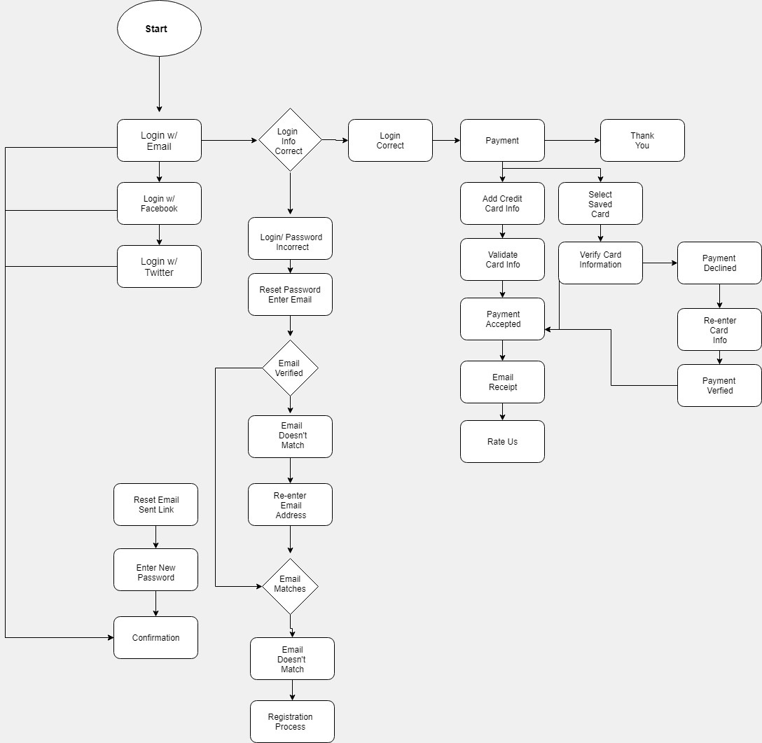
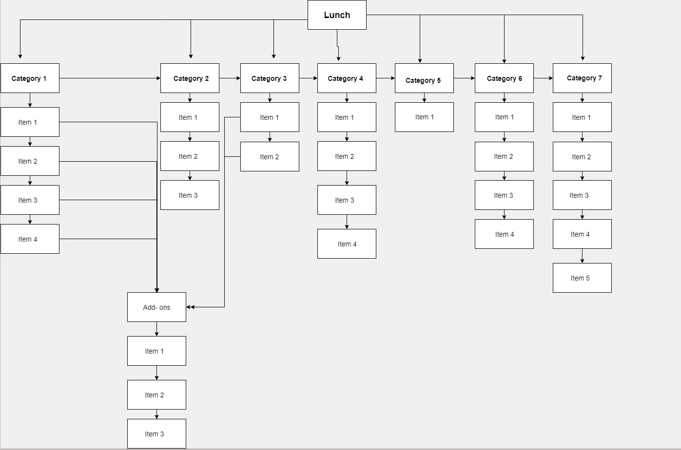
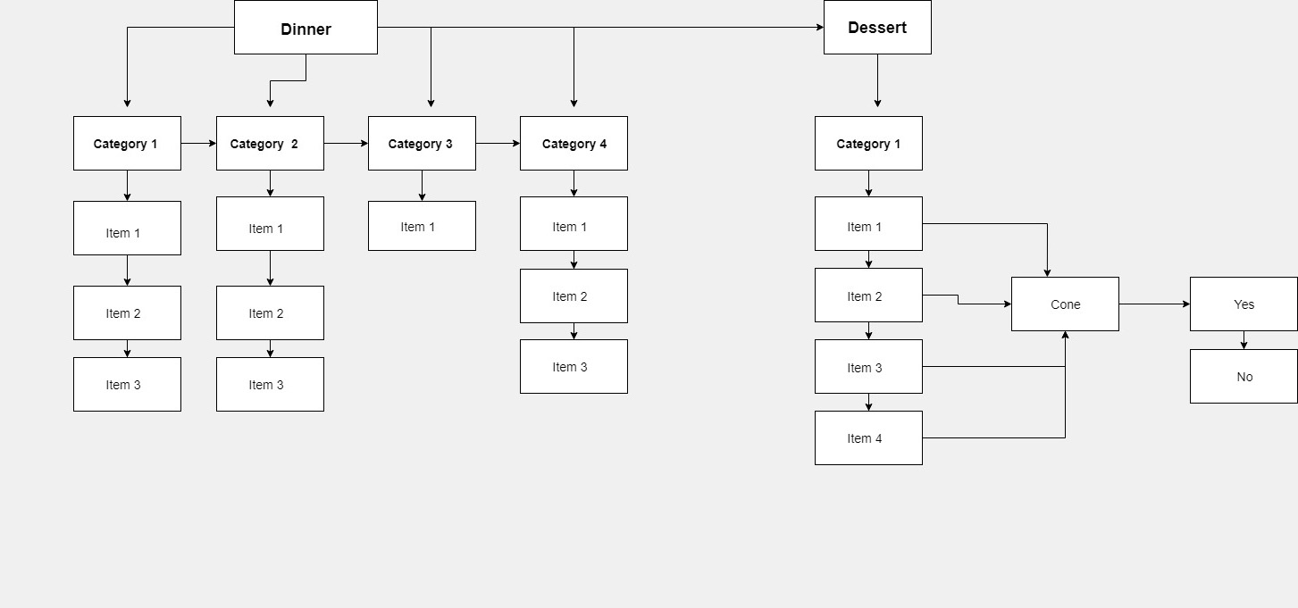
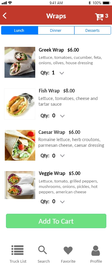
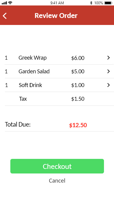
To ensure the users concerns were met, I created a few user flows outlining a path for each section of the application. I started with the following: Sign-up & Sign-in, Lunch, Dinner & Dessert menu options, and Viewing & Leaving a review.
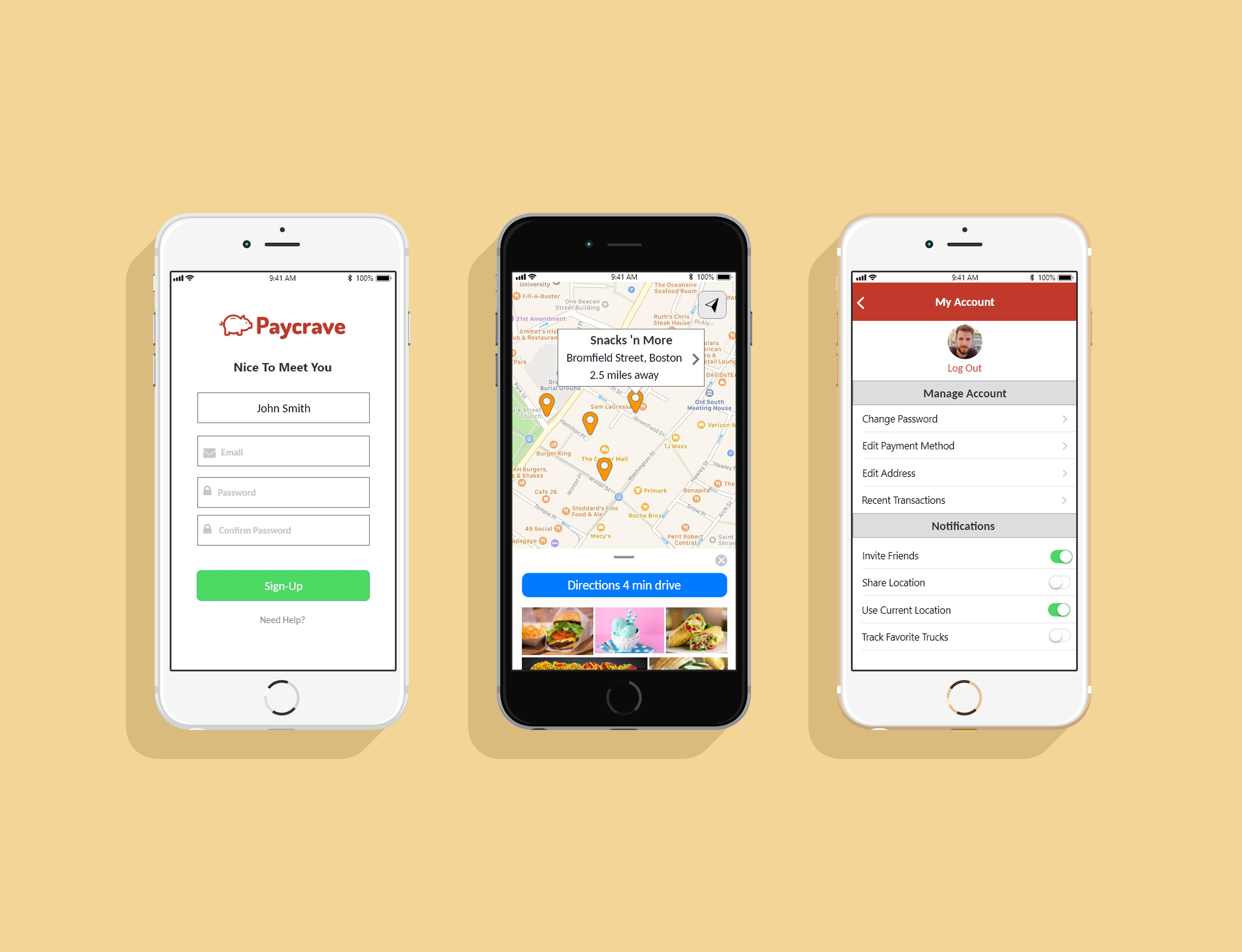
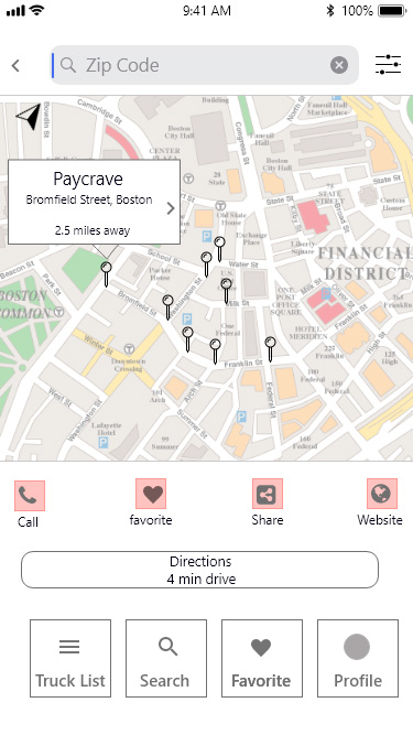
Explore fresh flavors and locate nearby food trucks effortlessly through the Paycrave app.
When hunger strikes out of nowhere where do you go? Restaurants can be pricey and time-consuming; food chains are boring and unappealing. While food trucks aren't exactly new, mobile technology has left the food truck industry in the dark ages. To date, there is not a quick and easy way to locate or purchase food from these fun and flashy trucks.
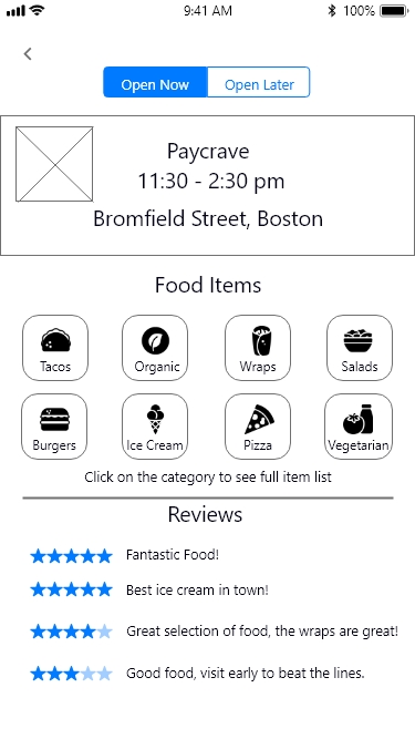
Craft an iOS application empowering users to effortlessly explore nearby food trucks, access truck specifics, menus, and customer reviews. Seamlessly select, order food, and securely complete payment transactions—all from your iPhone.
These five user stories showed me what features consumers were looking for in a footruck application. This information helped provide in sight as to how I would layout the main structure.
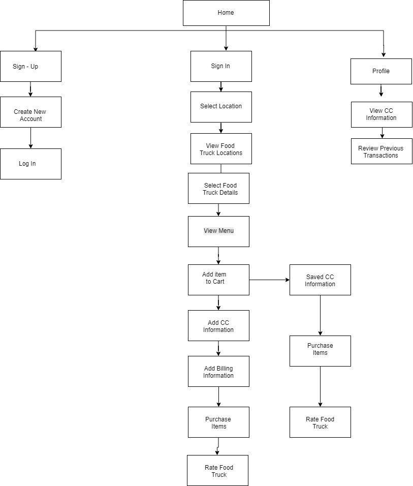
To help visualize how this mobile app would work, I designed a site map with the steps that needed to be built out.
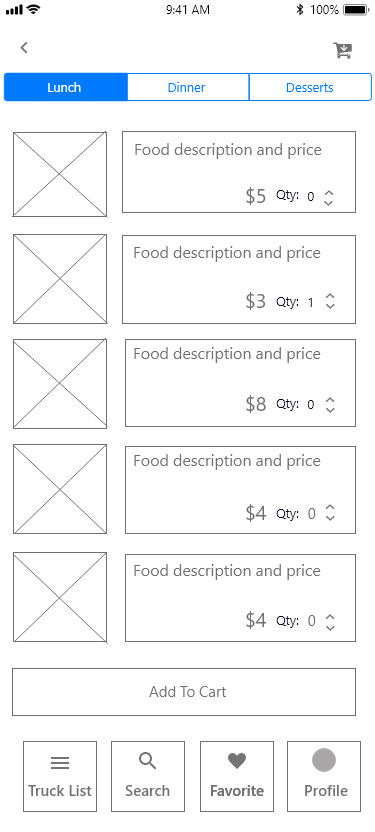
To ensure the users concerns were met, I created a few user flows outlining a path for each section of the application. I started with the following: Sign-up & Sign-in, Lunch, Dinner & Dessert menu options, and Viewing & Leaving a review.
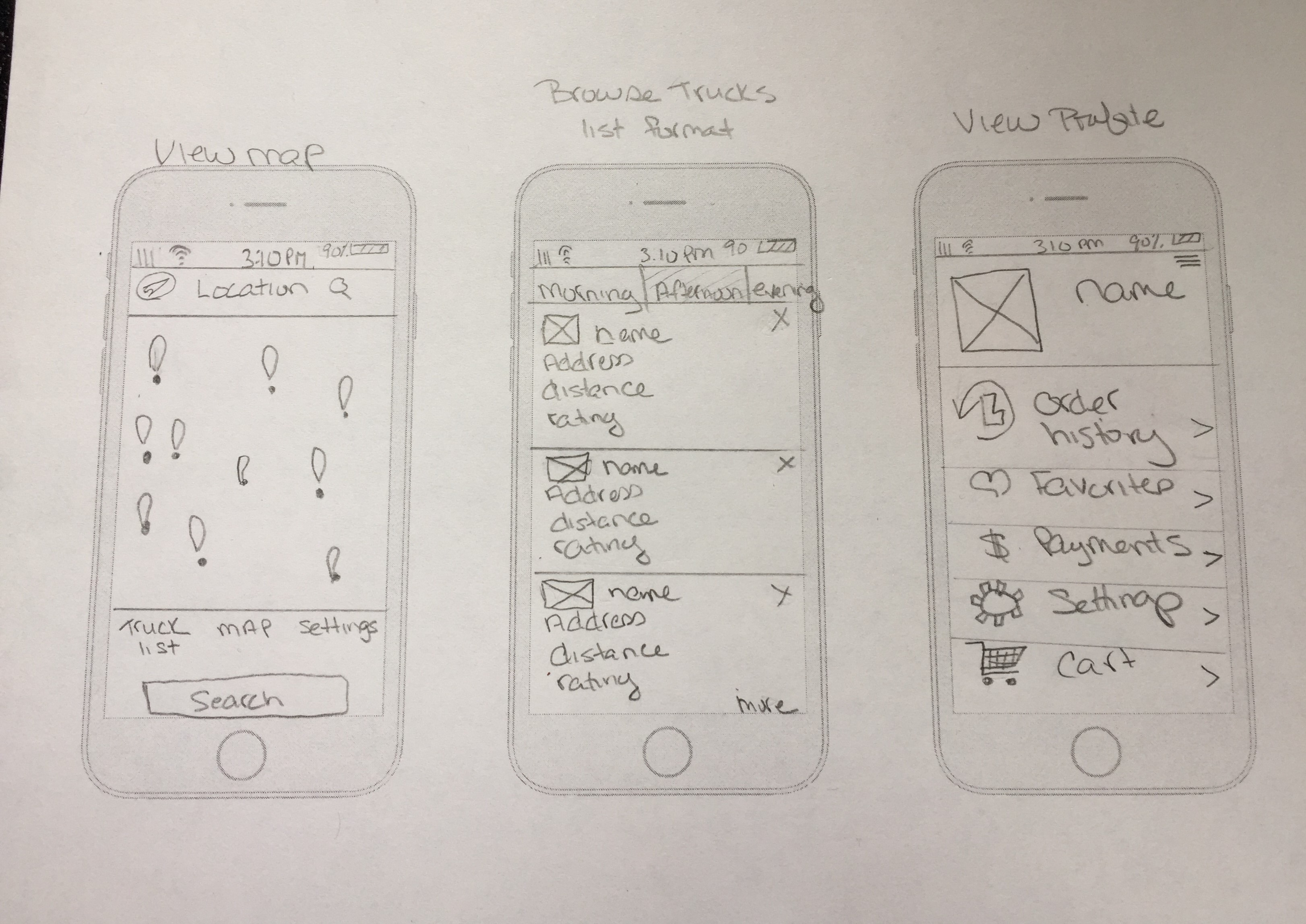
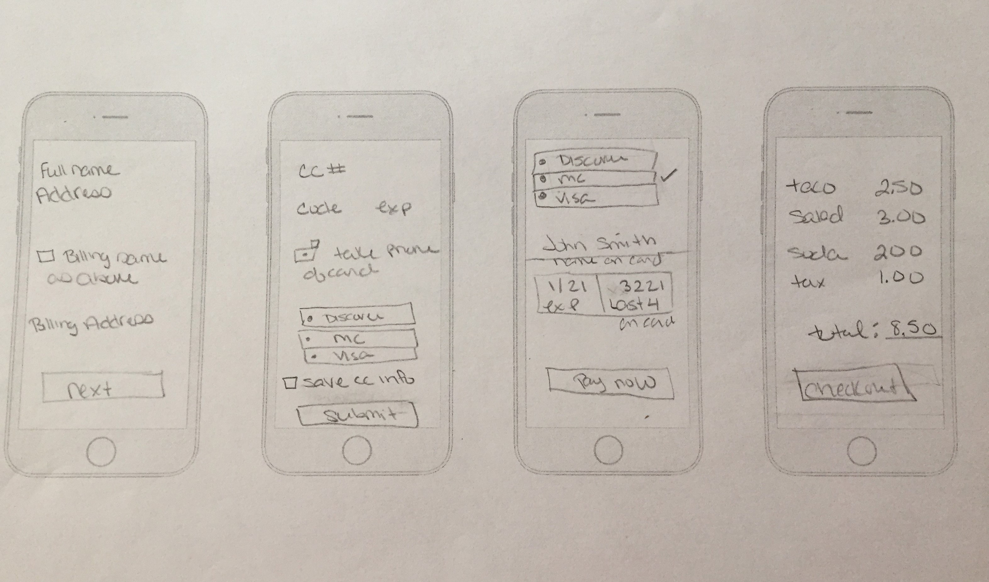
To get a good idea of what I wanted my screens to look like, I sketched out a few quick mockups then transfered those ideas into wireframes. I also did some user testing to see if the process made sense before moving to the secondary pages.
There were three users testing the Paycrave application, 1 male and 2 female.
The ages ranged from mid-30's to late 40's. All of the users tested on a desktop.
Each tester completed all 3 tasks and the process was approximately 15 minutes long
from start to finish.
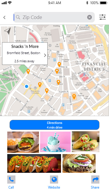
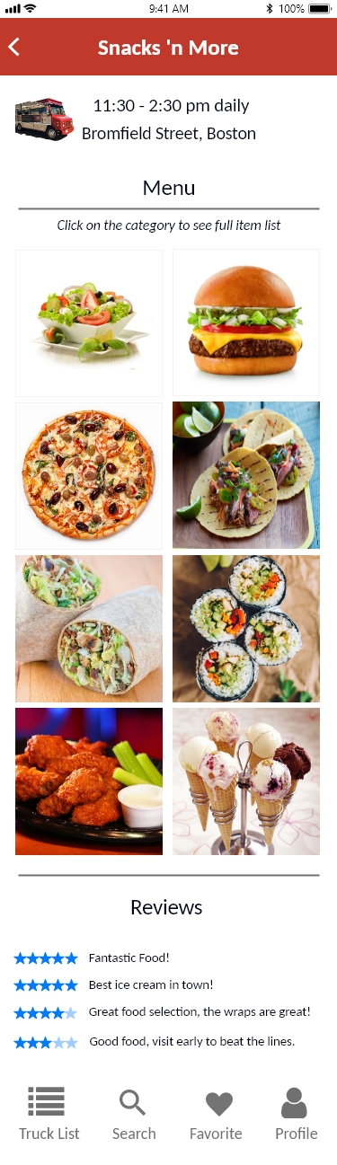
How would you find a food truck?
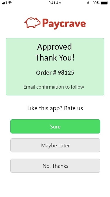
Show me how you would purchase a food item?
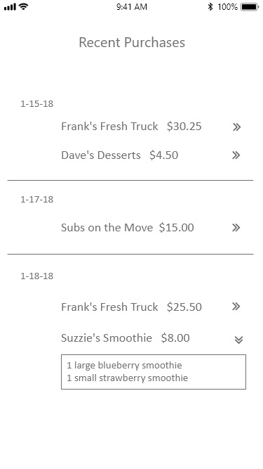
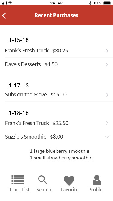
Where would you go to find your recent transactions?
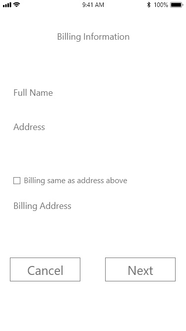
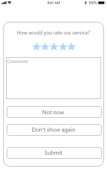
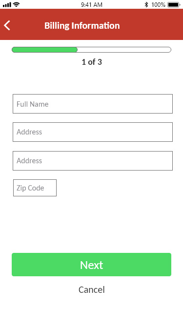
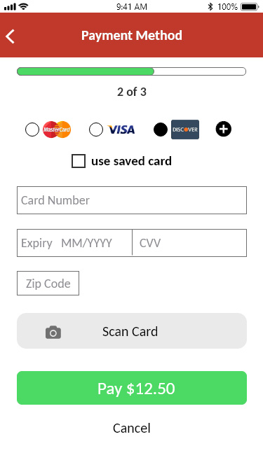
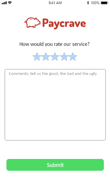
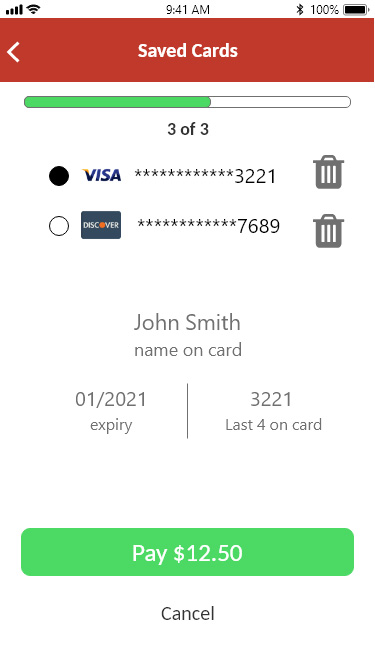
During the testing session, the "saved credit card information box" proved to be a problem. The location, while being in a obvious spot was difficult for the user to find.
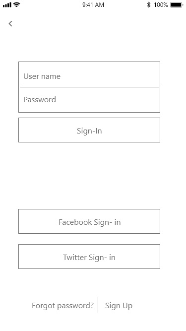
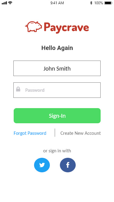
Another important issue the needed to be resolved was the lack of a sign-up screen. I created that in my user flows but didn't design it in the prototype. They would also like to know how far they are from the food trucks with a marker.
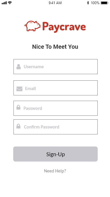
The last issue mentioned is that there wasn't any logo or company name on the sign-up or sign-up screens. The user didn't feel comfortable signing up to something that didn't have a name or logo on it.
All 3 users did work through the screens and were able to get through the ordering process without any major problems. The workflow process was straight forward and simple to understand.
There are definitely things that need to be fixed and added to the process. I felt that the users
were happy with the overall experience and were able to find the answers they were looking for to complete the testing
I will fix the concerns that the users had by changing the placement of a few items so they stand out more, add the sign in/sign up screen with the logo and company
name. Once that is completed I'll retest to see if the changes improved the outcome.
I added my content and images to the wireframes then did a second round of user testing. I had three different people test my site using the same questions for consistency. This gave me more feedback and suggestions where I made further changes.
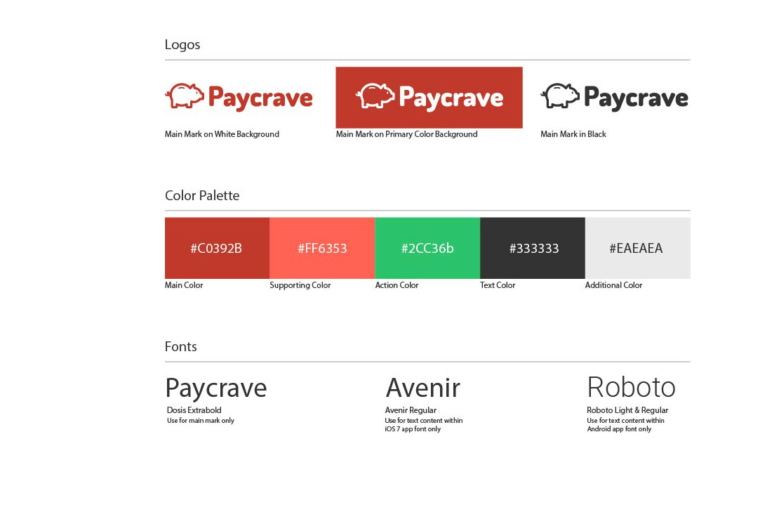
The style guide elements were provided for this project, while I was offered the opportunity to change them I thought this would be a great opportunity to design with certain required criteria.
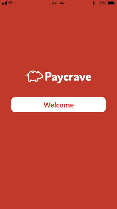
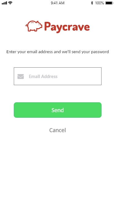
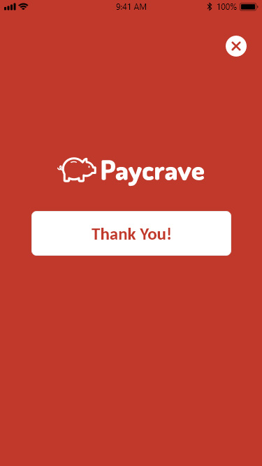
During the 2nd testing phase there were some additional recommendations that came up. The first was that I didn't have a sign-up screen just a sign-in screen. Which wouldn't allow new users to join. They also suggested adding a forgot password screen and thought that having a welcome, and thank you page would be nice to have. I created these screens to add to the process.
Overall I feel Paycrave is a success, the goals of application were fullfilled, the users were able to complete the tasks and the app was easy to understand and navigate. I was struggling with some of the design process as to which options needed to be available on the screens. The feedback helped to reassure my thought process made sense and showed me what needed to be fixed/revised. I made changes based on the feedback and conducted a new user testing with the new changes.
During this project I wanted to be able to think "outside the box" and create something unique but not knowing enough about the "rules and regulations" of what I can and can't change left me a bit frustrated. I changed my design many times before deciding to stick with something that looked familiar to me.
There were additional challenges I needed to overcome in this project. ISO guidelines required design revisions to my wireframes to ensure they met industry standards. Using the style guide provided by this project, I needed to remember not to change those elements in my work and to use the exact colors and font styles directed on the guide. I enjoyed designing Paycrave, through the lessons learned I can continue to use and expand my design skills. Still in progressing development is my work on time estimating skills and my speed. Skills that I know will improve with time and experience. All of which will lead me to design better products more efficiently.