 Home
Work
Services
Mentoring
About
Contact
Scuba Adventures is an e-commerce site designed for divers of all experience levels to find and book their next dive.
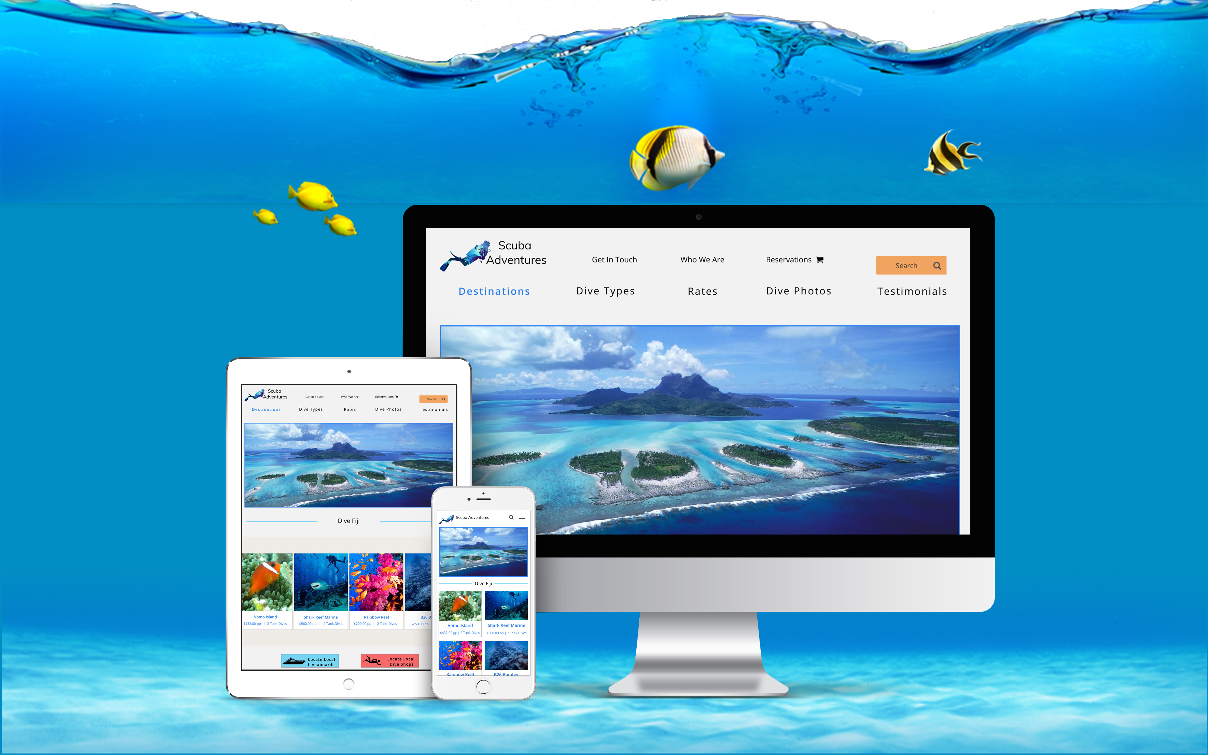
Scuba Diving is a great way to explore the world we live in, with so many locations and diving types available it would take several lifetimes to see it all. Today's technology allows you to book your next excursion in minutes and explore your dive site within hours. However, efficiently researching and booking dive locations can be limited unless you have a specific destination in mind or are opting to stay at a dedicated diving resort
Scuba Adventures, an ecommerce site providing exceptional global diving and liveaboard rates. Offering expert insights on dive sites, country-specific requirements, comprehensive information, and pricing for each location guarantees worry-free exploration without concerns of overpaying.
I created two Google surveys aimed at gathering valuable insights into diving habits. These surveys focus on determining the frequency of diving throughout the year, preferred diving destinations, trip durations, equipment ownership versus rental preferences, and the typical group size for diving expeditions.
of divers prefer
International
dive locations
own their Scuba gear
Location: most vital
Cost & Transit: least vital
trips are primarily
1-2 days long
Analyzing the survey data, I conducted an in-depth assessment of three leading Scuba diving companies. My focus was on understanding their offerings, target audience, commonalities, and unique attributes. By evaluating their strengths and weaknesses, I aim to discern how this site can distinguish itself in the competitive diving market. Let's explore these insights further!


I want to be able to search by location, skill level, cost, or dive type to help speed up my search time.
I want to be able to chat with a live person who is knowledgeable about the locations and able to answer my questions.
I want to purchase multi-day dive packages so I can save time and money on my next dive trip.
I want to see photos of the dive locations and accommodations so I know what is included in the cost.
I want to sign up for newsletters so I can receive information on sales and when new dive locations are available.
I want the shopping experience to be exciting, easy, and hassle-free by creating a site that is simple to navigate.
I want to know what items visitors are viewing so I can have the chat feature available for questions/concerns.
I want to offer multi-dive packages which will save customers money and allow them to dive more on their trip.
I want to create a community where divers can share their photos and experiences on dives they booked through us.
I want to offer a newsletter and a rewards program allowing my customers to save money when they refer a friend to the site.
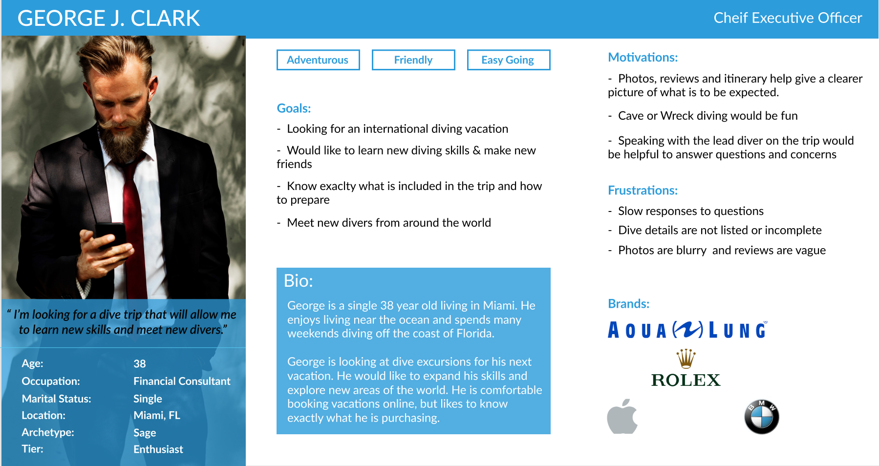
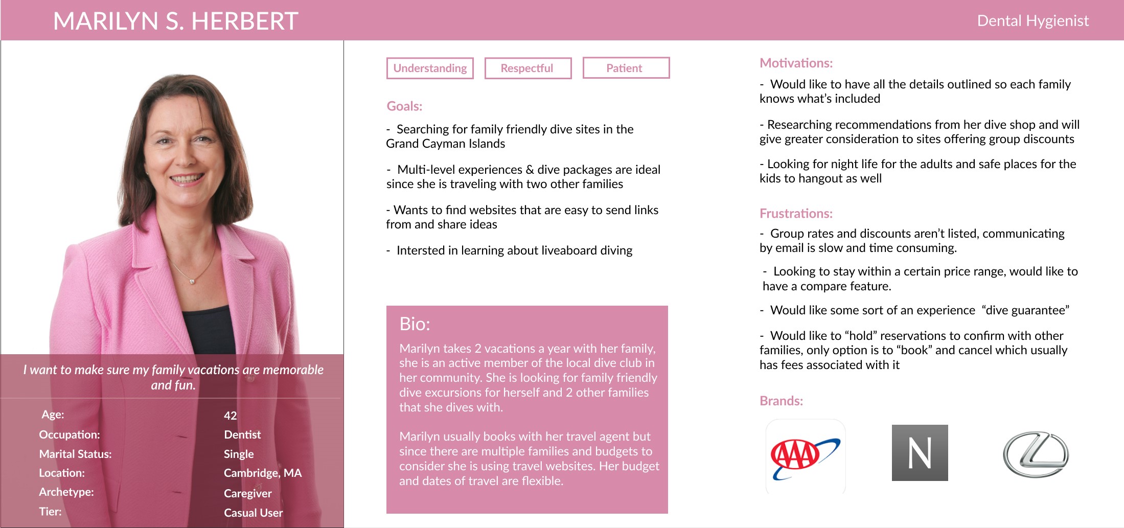
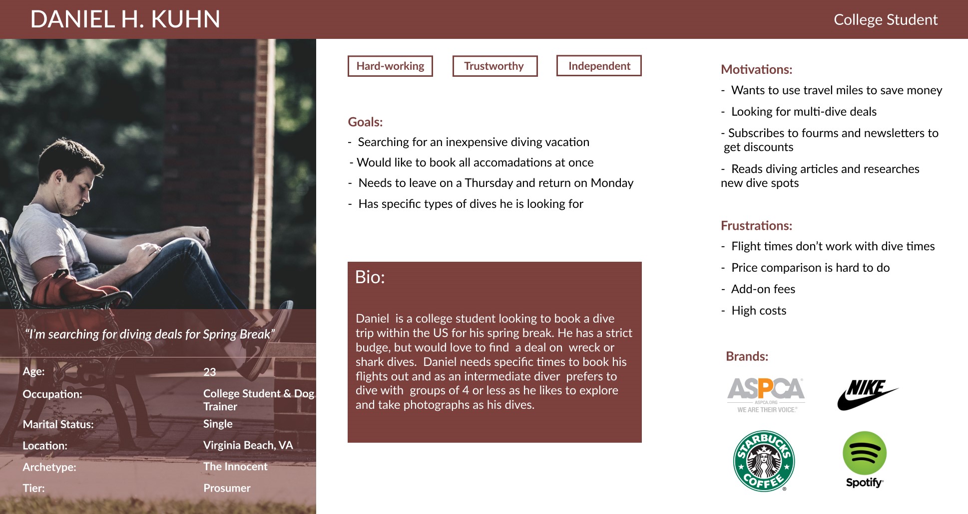
The survey findings revealed three significant groups within our audience—those in their 20s, 30s, and 40s. Leveraging this data, I developed three distinct personas that explore their particular goals, challenges, and motivations when exploring dive sites in depth.
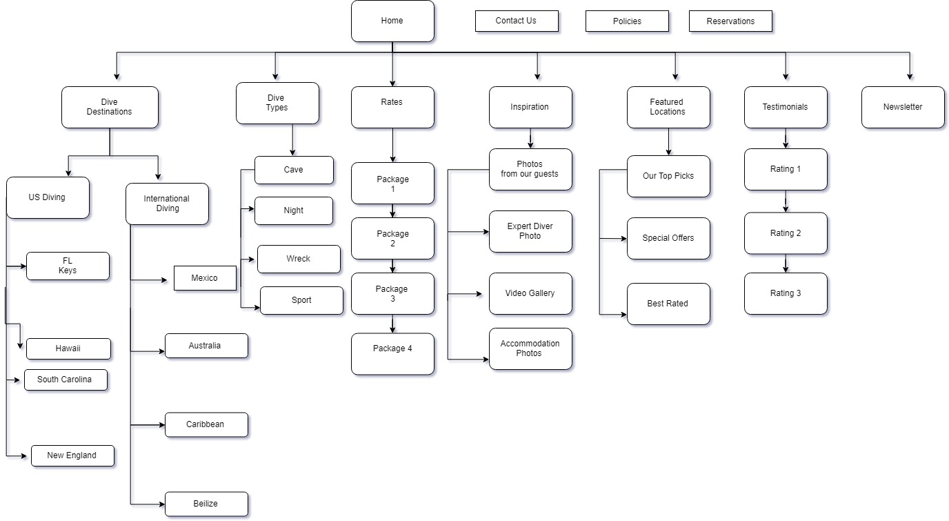
The sitemap offers a variety of navigation routes for discovering the desired diving sites. You have the flexibility to explore by location, dive type, or explore featured destinations. Additionally, you can stay updated by joining the newsletter, peruse fellow divers' reviews, and even contact the company for exclusive rates.
I developed five user flows that directly stem from the insights gathered in the survey results. These flows intricately outline the step-by-step processes for addressing each unique request identified in the surveys.
.jpg)
.jpg)
.jpg)
.jpg)
.jpg)
I developed initial low and medium fidelity screens to establish the fundamental user interface. These screens were instrumental in conducting user tests, validating the workflow, and ensuring coherence in the design process before advancing to secondary pages.
Three individuals participated in testing the Scuba Adventures website, comprising one male and two females with ages ranging from the mid-20s to late 40s. Each user conducted the tests on a desktop platform. The testing procedure involved completing three specific tasks and lasted approximately 10 minutes from initiation to completion.
Tasks included:
The primary usability concern encountered by all three users was related to misunderstanding the functionality of the 'Reservation'button. When prompted to book a reservation, all testers attempted to access the 'Reservation' button located at the top of the screen. However, it was not yet clickable because I intended it as a feature to review existing purchases. All three users assumed it was meant for initiating a new reservation rather than checking or reviewing an already made reservation.
During testing, a minor yet crucial concern arose when a user expressed uncertainty regarding the confirmation of their message submission. The absence of any indication that the message was successfully received by the company led to uncertainty. Similarly, this issue surfaced during the 'submit a quote' task, where the user lacked confirmation that the quote had been successfully sent to the company.
In reviewing the user testing outcomes, all three users navigated the screens successfully and completed the tasks without encountering significant issues. The workflow appeared straightforward, facilitating an easy understanding of the process. While users managed to proceed without major obstacles, certain aspects require refinement and restructuring. Overall, the users expressed contentment with the experience and demonstrated adaptability in navigating around identified issues to accomplish their goals. My plan involves addressing the common major issues encountered by all three users. This will involve revising the structure and wording to enhance the clarity of each buttons purpose and content. Subsequently, I intend to conduct a retest to evaluate if the adjustments have positively influenced the overall outcome.
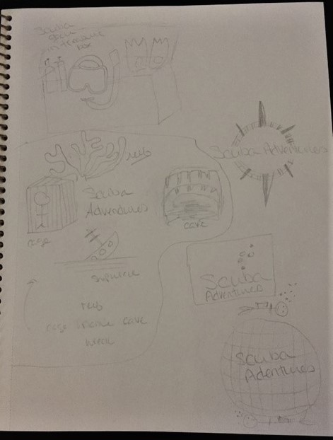
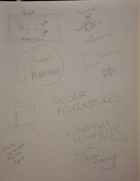
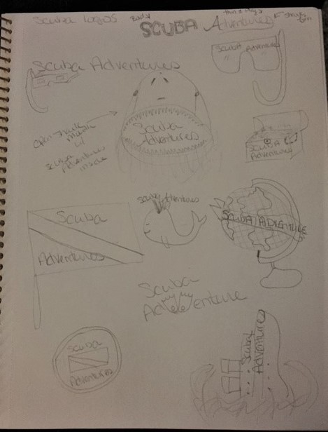
I began by sketching out 8-10 logo ideas, carefully refining them until I settled on 2 standout concepts. These two were further developed with multiple variations, seeking valuable input from peers and mentors. After receiving feedback and considering various perspectives, I arrived at a final design that's perfectly suited for all marketing needs, ensuring its visual impact remains consistent whether on a small business card or a large billboard
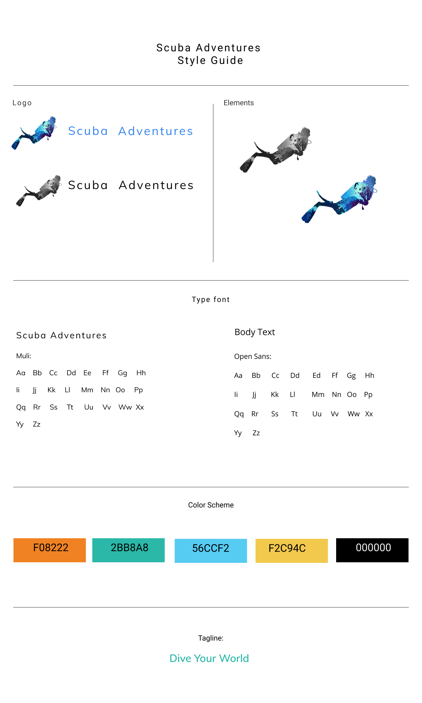
Creating my color palette was a straightforward process. I opted for fundamental oceanic hues, complemented by additional colors to distinguish it from competitors.
When considering typography, I initially opted for Roboto. However, its compatibility with Gabriela didn't align well during logo design. I switched gears to Muli for both the website and logo. However, acknowledging the unique requirements of the logo, I ultimately chose Open Sans for the site due to its versatility in font styles, while Muli remained the designated font for the logo.
I consolidated all assets to craft a style tile, ensuring a unified and cohesive design approach as I transitioned into the hi-fidelity wireframes..
I incorporated content and images into the high-fidelity wireframes and then conducted a second round of user testing. Three individuals tested the site using the same set of questions, providing additional feedback and suggestions. This feedback guided me to make further adjustments to the design.
As the design process neared completion, I identified specific areas needing additional feedback. To gather more insights, I devised three preference tests.
Which structure of the navigation bar did you like better?
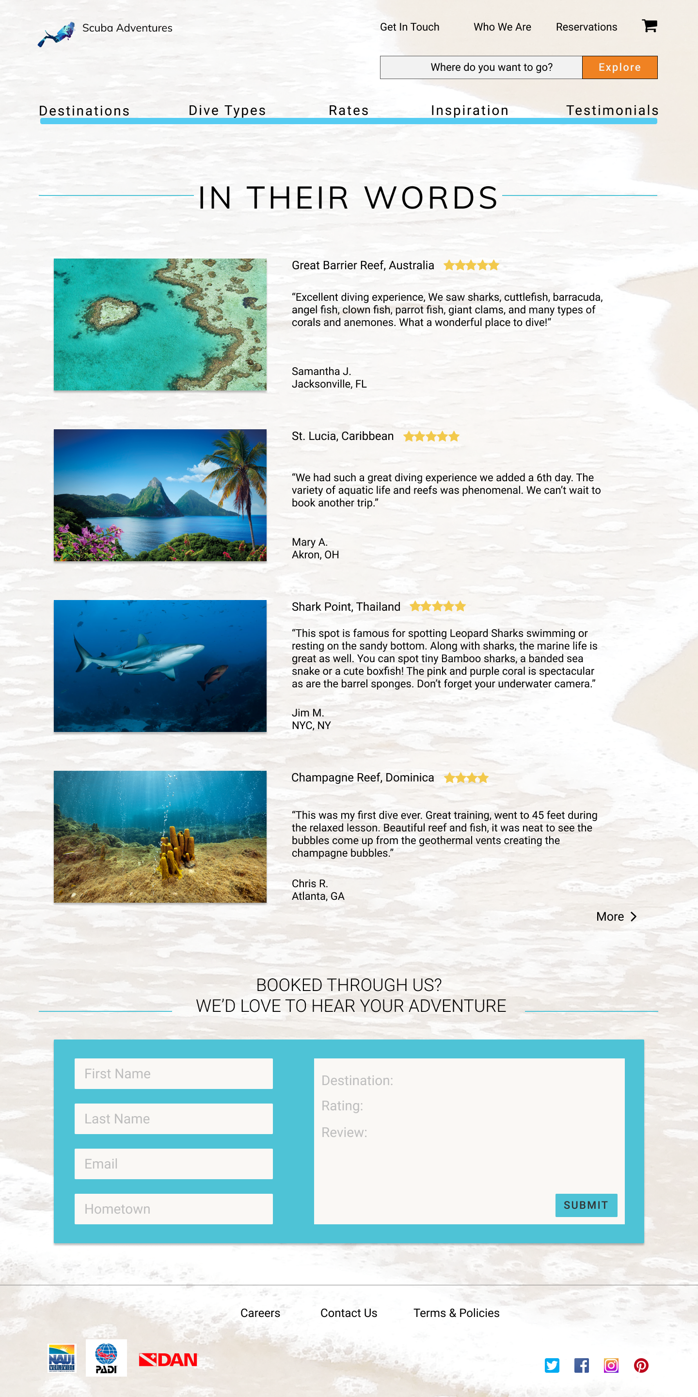
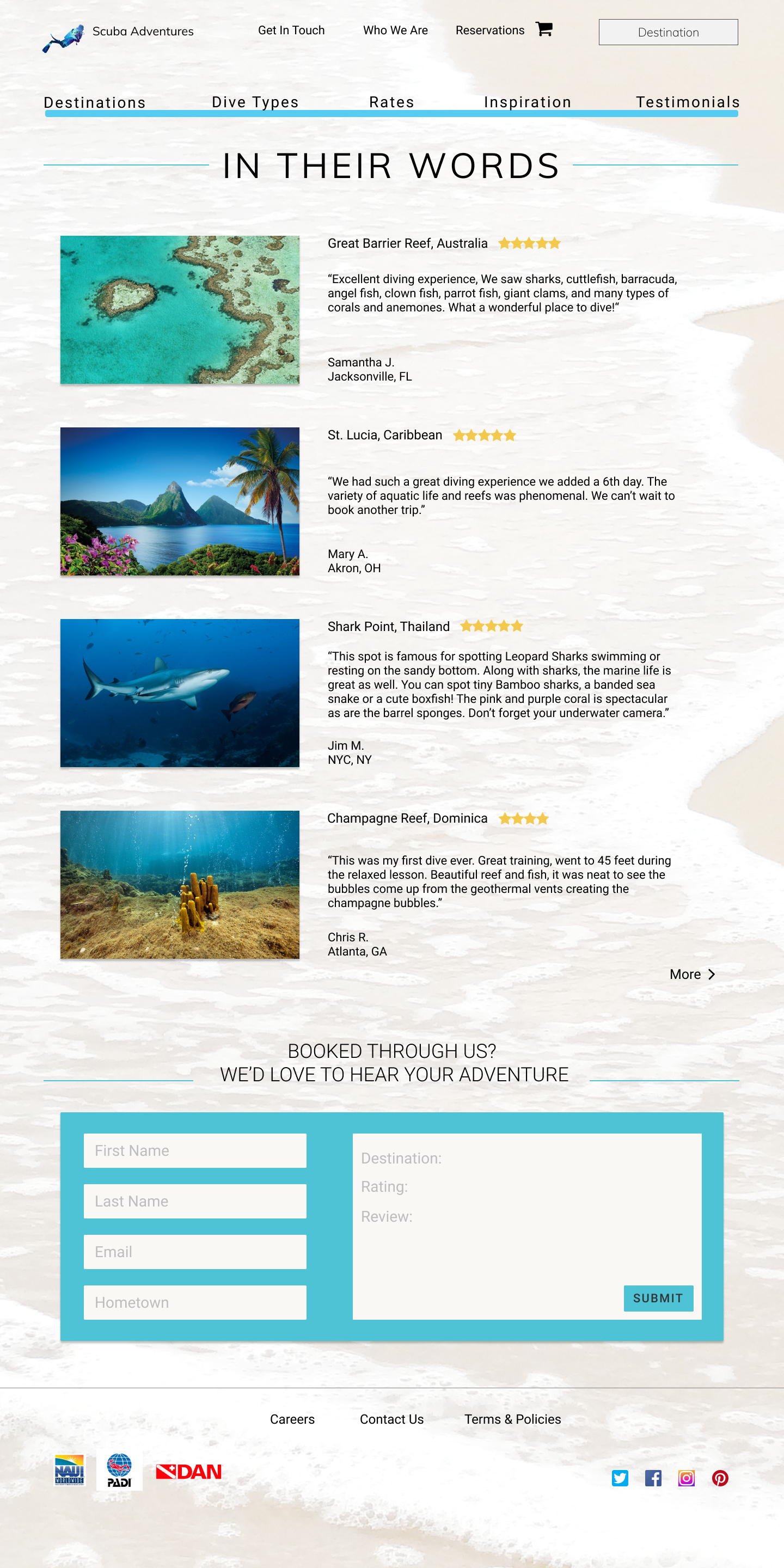
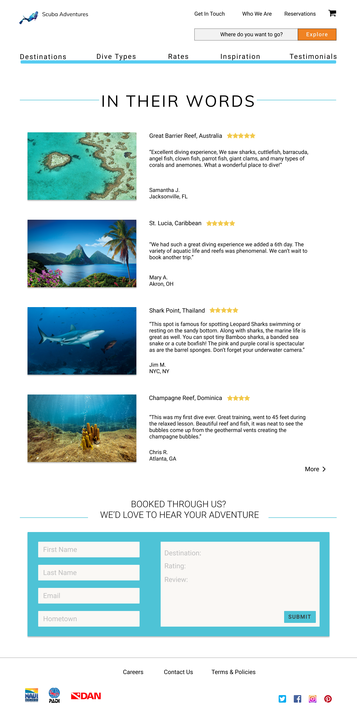
Do you like the whole title capitalized or just the first letters?

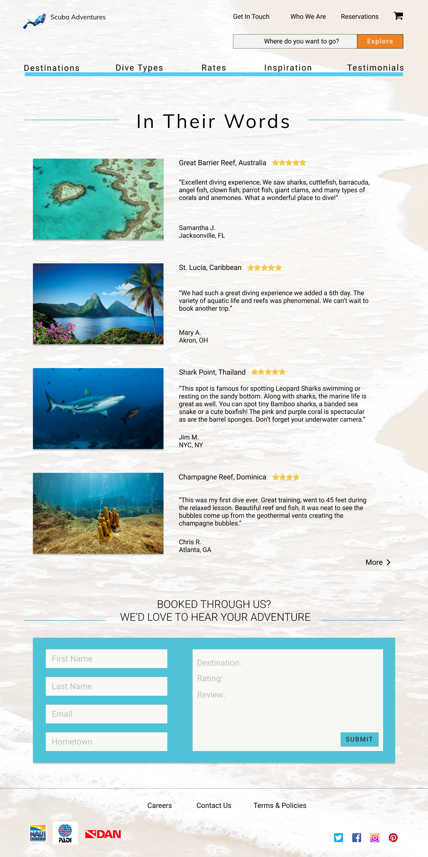
Is the faded background photo distracting on the testimonial page?

Following the conclusion of the three tests and a comprehensive review of their outcomes, I leveraged the invaluable feedback gathered to refine and sculpt the ultimate design solution.
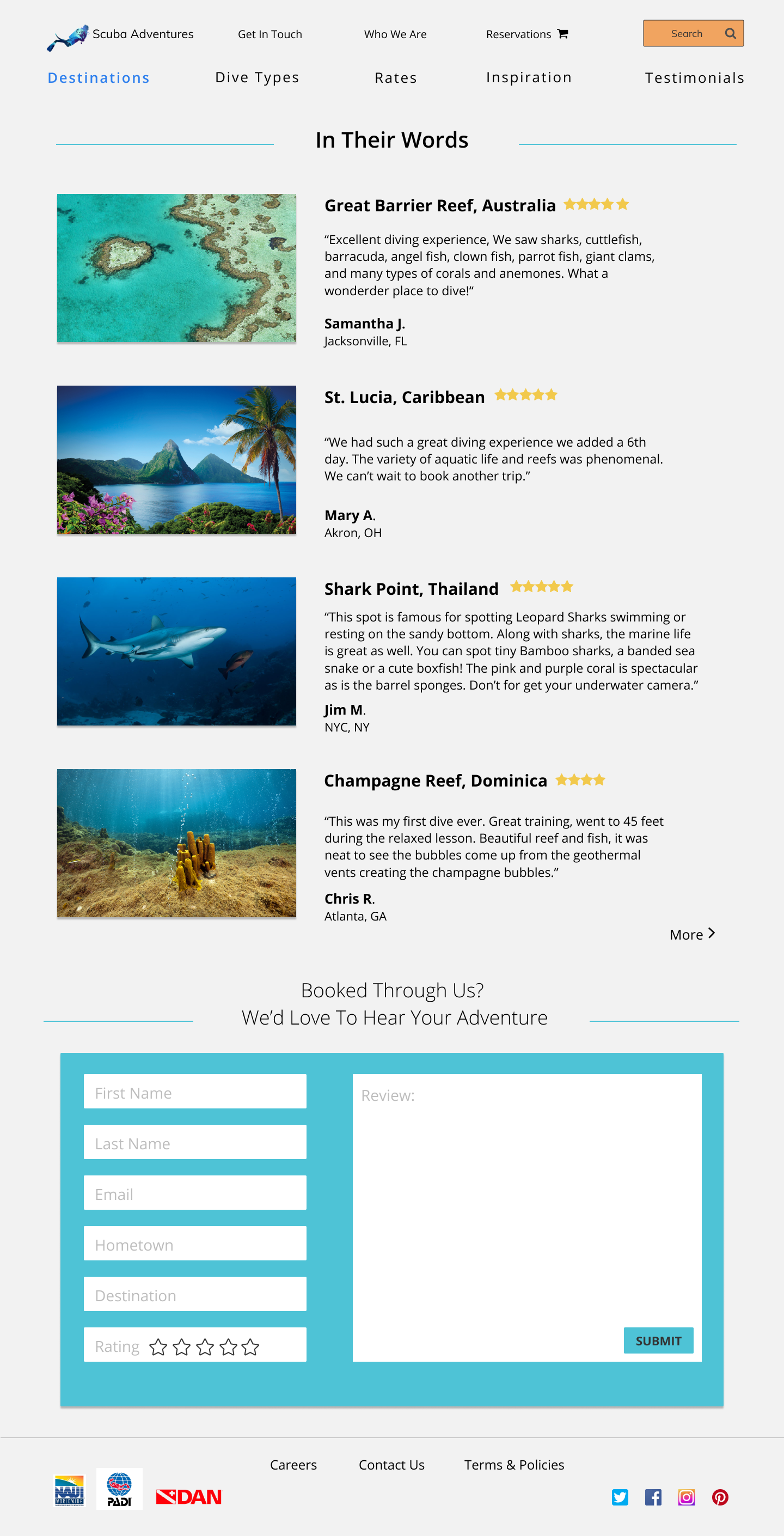
Assessing the successes and challenges, the website overall accomplished its intended goals. Users could seamlessly complete tasks and appreciated the site's aesthetics. However, certain aspects required redesigning; some processes proved lengthy for users, not aligning well with their needs or the business objectives. When embarking on this project, I harbored no particular concerns. My choice of the topic was fueled by my passion for diving and travel. My aim was to create a platform facilitating smoother experiences for individuals seeking their next adventurous dive.
I was pleasantly surprised by how expansive this topic became, allowing for more extensive information than initially anticipated. It often prompted me to realign with the original outline and prioritize user preferences over my assumptions.
Regarding improvements, I aim to ensure every listed destination includes at least one diving location. Moreover, I plan to enrich the country facts section to offer users a more comprehensive experience.