Be Ready Fitness
Be Ready Fitness is a dynamic personal training studio nestled in Bedford, MA. Tailored for busy professionals, the studio is dedicated to helping individuals achieve their fitness goals by offering top-notch workouts crafted to suit diverse schedules and aspirations.
The Problem
The owner approached me with a request to craft a company logo that resonates with his current clientele. He's in need of a logo that not only stands out prominently on the plaza sign but also retains its visual appeal when scaled down for business cards, marketing materials, and apparel.
The Solution
Create a company logo that embodies the essence of quality workouts and the achievement of client goals within busy schedules.
Consultation
Client Discovery Call
To gain deeper insights into the client's vision for the logo design, I organized a consultation meeting to explore his specific requirements and creative ideas. During our discussion, the client emphasized the unique nature of his studio, highlighting its commitment to providing personalized, one-on-one training—a crucial aspect he desired reflected in the logo's design.
Furthermore, the client emphasized the studio's core values, particularly emphasizing efficient time utilization during training sessions to ensure an exceptional workout experience for every individual. Additionally, there was a strong interest in using the logo across a variety of fitness merchandise and apparel, envisioning its placement on items like foam rollers, massage balls, hats, and other fitness-related products. This strategy aimed to create a strong, consistent brand identity across various materials.
Research
Competitive Analysis
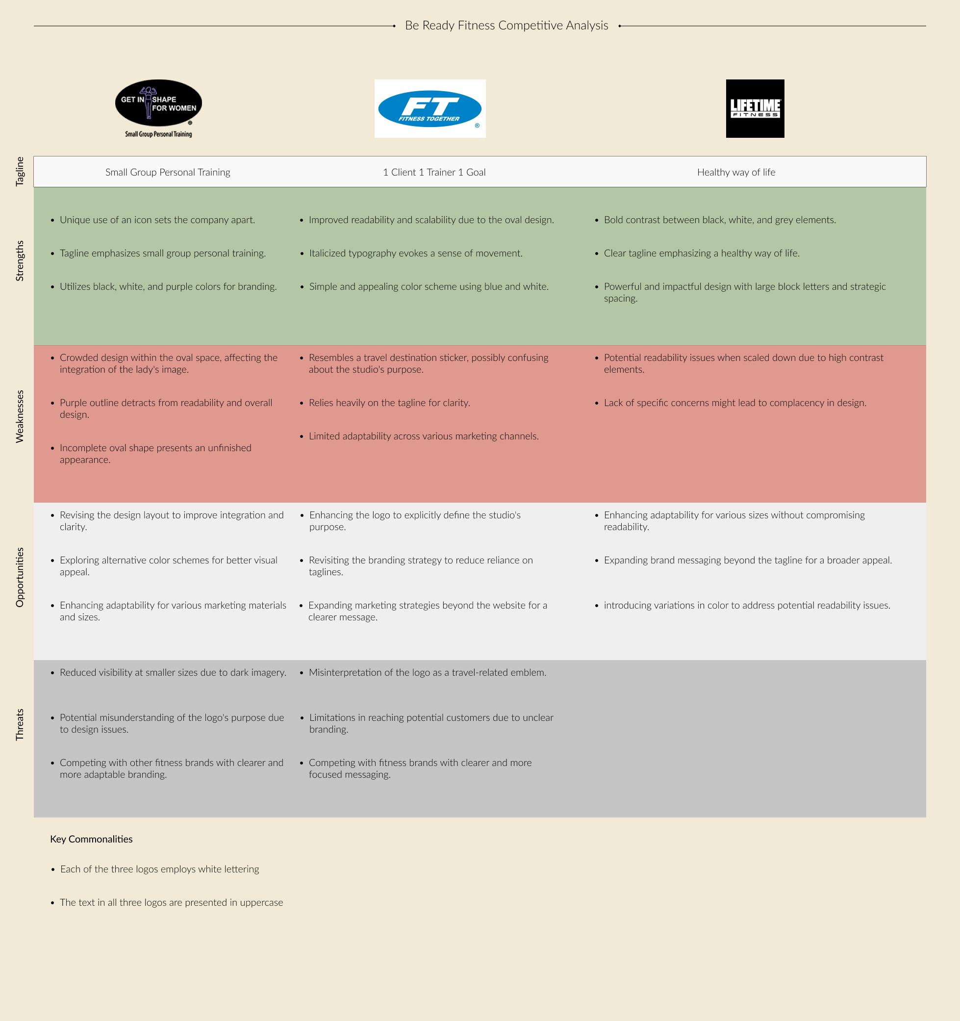
In gaining insight into the local fitness scene, I examined various personal training studios and gyms in Bedford. This involved a thorough analysis of their logos, color schemes, and typography. After selecting the three most relevant businesses, I proceeded with a competitive analysis. This approach unveiled patterns and aided in assessing the strengths and weaknesses inherent in each logo design.
Brand Identity
Logo Sketches
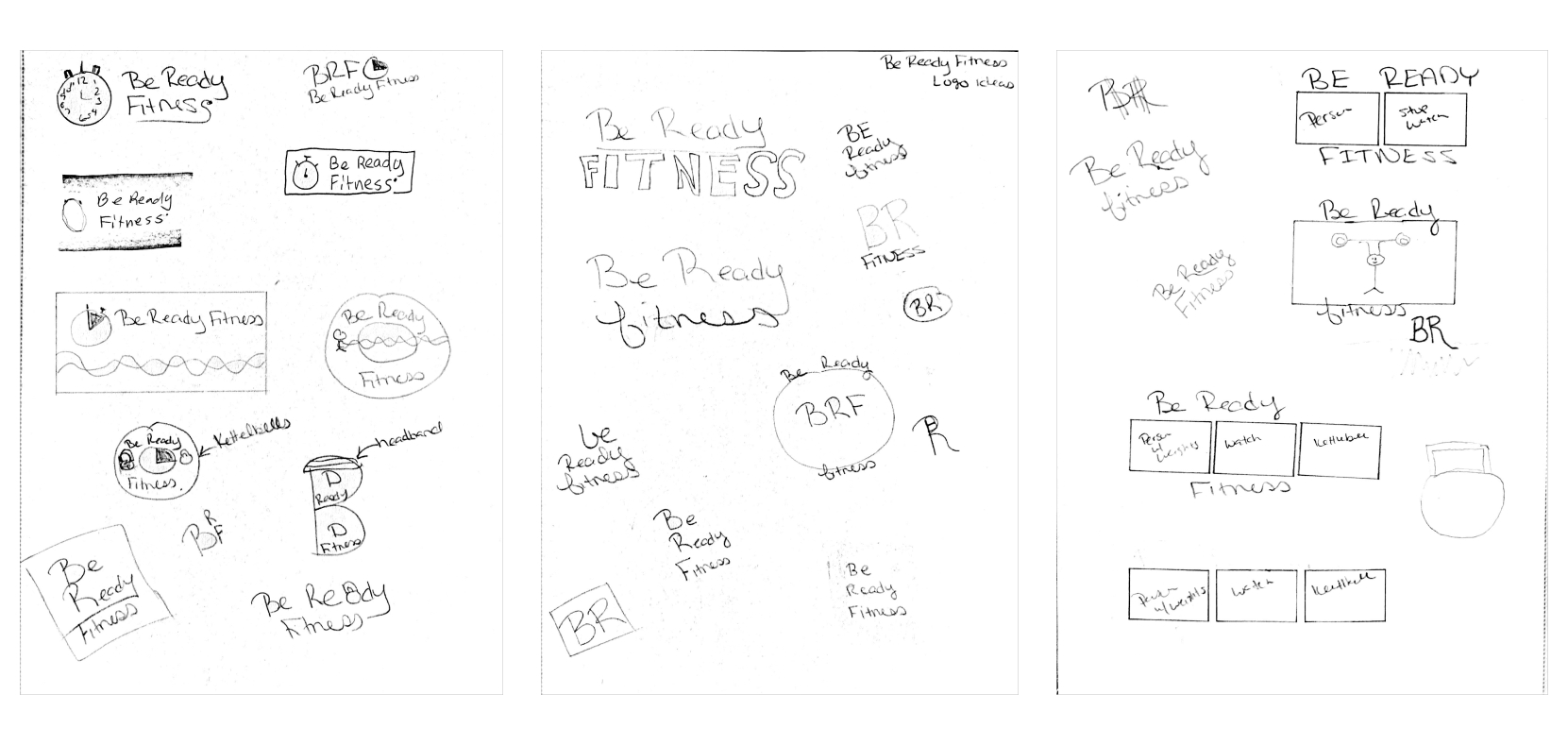
After familiarizing myself with various fitness logos in the local area, I began the creative process by sketching initial logo concepts inspired by fitness themes. Presenting those sketches to the client allowed me to gather his initial feedback and preferences. Following his review, the client expressed a distinct interest in a particular style and requested further exploration within that chosen direction.
In response to the client's preferences, I developed three additional iterations adhering to the favored style. These new variations were carefully crafted to incorporate different icons, placements, and border styles, precisely meeting the client's request within the selected theme.
Typography
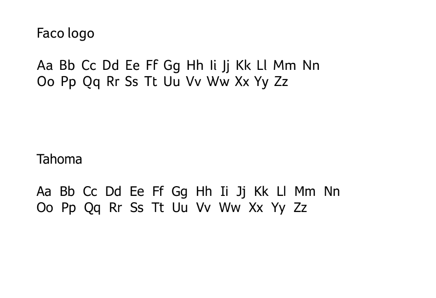
With attention directed towards choosing the ideal font for the new logo, the client stressed the need for a versatile font capable of ensuring readability across different sizes and formats. Beginning the process, I explored various font options, including Arial, Average, Foco, and Tahoma, gradually narrowing down the choices to Foco and Tahoma. Through experimentation with these fonts across multiple logo concepts inspired by the initial sketches, my aim was to pinpoint the perfect match that aligned harmoniously with the brand's visual identity.
Color Selection
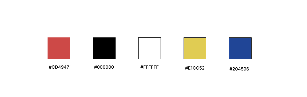
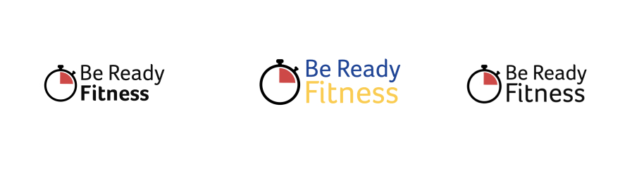
Be Ready Fitness' color scheme underwent a series of transformations and explorations. Initially, the client entertained the idea of integrating a wide spectrum of colors - blue, yellow, red, white, and black - without a clear primary choice. Upon thorough research into competitors' logos, we discovered that blue held significant popularity among local gyms.
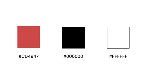
As we explored the refinement of the palette, the client was drawn towards simplicity. The final choice centered on a polished palette, focusing on black and white as primary colors, complemented by a striking touch of red.
Preference Testing
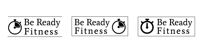
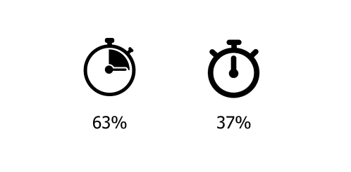
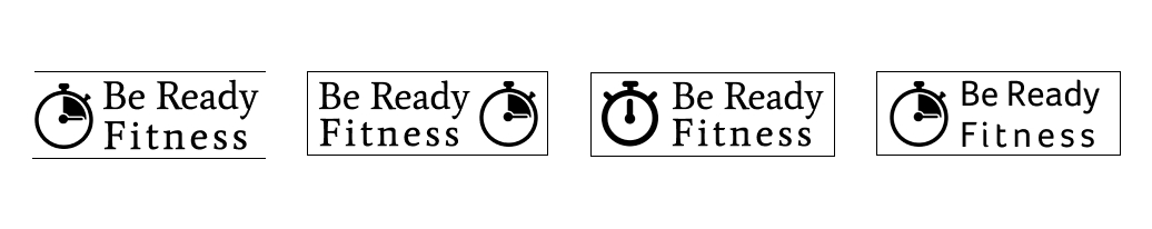
Which icon do you like better for a fitness logo?
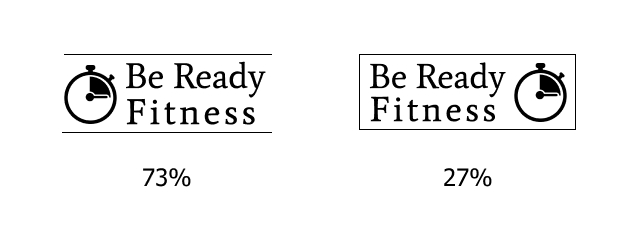
Which placement of the icon do you like better?
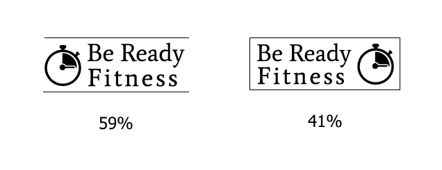
Which border do you prefer on this logo?
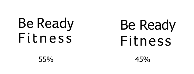
Which font do you like better?
Design based on testing session results.

Before adding colors to the logos, I sought feedback on the basic design elements. After producing different logo variations, I organized a detailed preference test with 7 participants. This test focused on their preferences for icons, fonts, and borders. The insights gathered from this feedback will help refine the design.
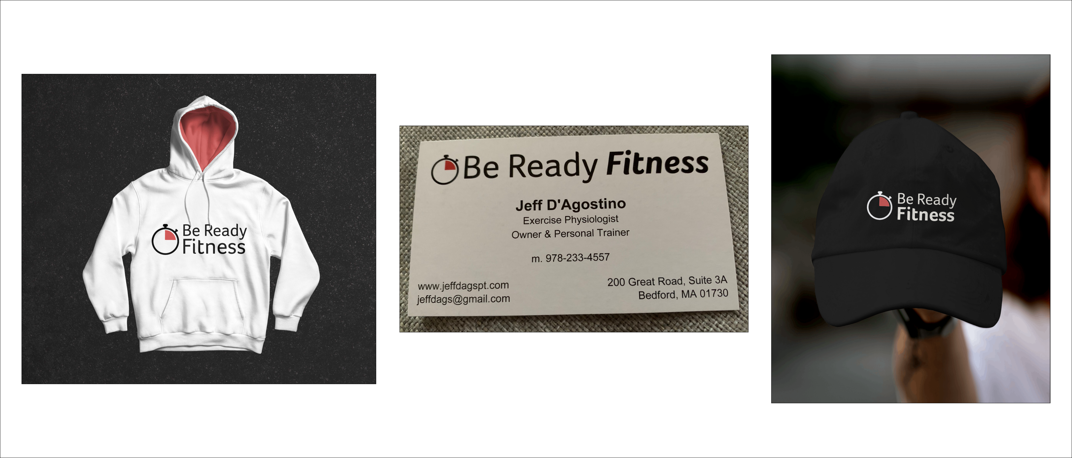
After completing the preference test, I showcased four logo designs to the client. Three of these logos were used for the testing, and the fourth was the result of that test. The client selected their preferred design from these options. As we continued refining the chosen design, a significant modification involved deliberately removing the needle from the image. This intentional simplification highlighted the wedge as the standout feature, greatly enhancing the logo's adaptability and visual impact.
Upon securing the client's approval for the design, I seamlessly integrated their selected colors and fonts. To enhance the logo, I strategically emphasized the word 'fitness.' Additionally, I created a version incorporating the original yellow and blue colors, directly contrasting it with the simplified iteration dominated by black and white tones accented with red. This side-by-side comparison was crafted to highlight the contrast between the 'minimalist' rendition and the one retaining the original colors, allowing the client to evaluate the distinct impact of each variation.
Final Result
Once the client selected their preferred logo design, I showcased its adaptability by creating mockups on various items like sweatshirts, business cards, and marketing materials. This provided the client with a comprehensive visual representation of how the logo would appear across different sizes and mediums, helping them understand its versatility.
Conclusion
Client Follow-Up
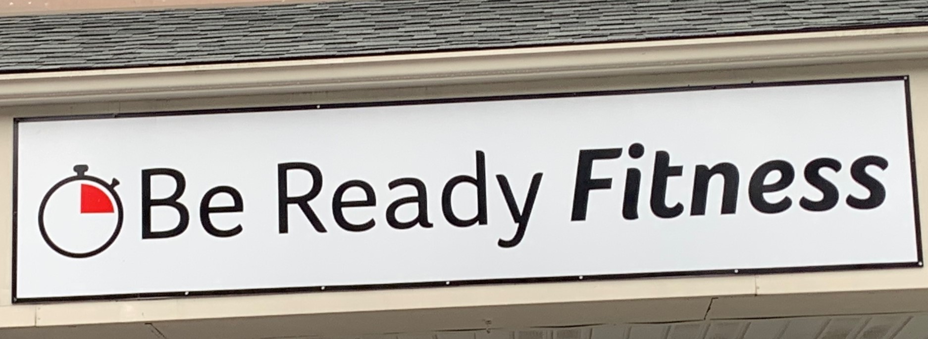
A few weeks later, I arranged a follow-up meeting with the owner to ensure that the logo fulfilled his expectations and was easily usable for his needs. During our meeting, he proudly showcased the recently installed street and store signs featuring the logo design.